Can shapes, systems, and chaos help us understand pandemics?
Why do people study mathematics? They spend all day learning these abstract concepts with seemingly little real-world value. However, mathematics is the foundation of so many disciplines from physics, to computer science to the spread of infectious diseases. As COVID-19 is gripping the world, we can use mathematics as a lens to gain some insight into how COVID-19 is spreading. Now it’s important to note that this is an incredibly complex question, but we can try to understand it at a high level using a model called the logistic map.
Suppose that epidemiologists have found that if there are percent of a population infected today with COVID-19, then the percentage of the population infected tomorrow will be:
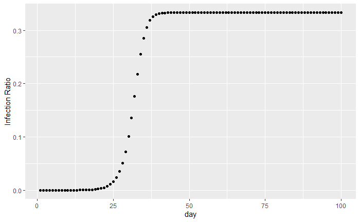
Where is the percentage of the population that is infected with the disease at a given time t. While is a number between 0 and 4 that describes how many new people an infected person gives the disease to at each time, minus one. For example, early studies have shown that on average an infected person transmits COVID-19 to 2.5 new people, so the value would be 2.5 - 1 = 1.5. We can visualize the logistic map and its model of COVID-19 spread with a diagram. We start the model with one out of every million people initially being infected. For example, in the United States that would mean approximately 330 people would be infected on day 1.
 |
|---|
| Figure 1 |
Formally, this type of model is known as a dynamical system. A dynamical system is simply the evolution of some processes over time. In this case, we are looking at how the process of disease infections changes over time. Dynamical systems can be broken up into two parts, what is changing over time, and how does it change.
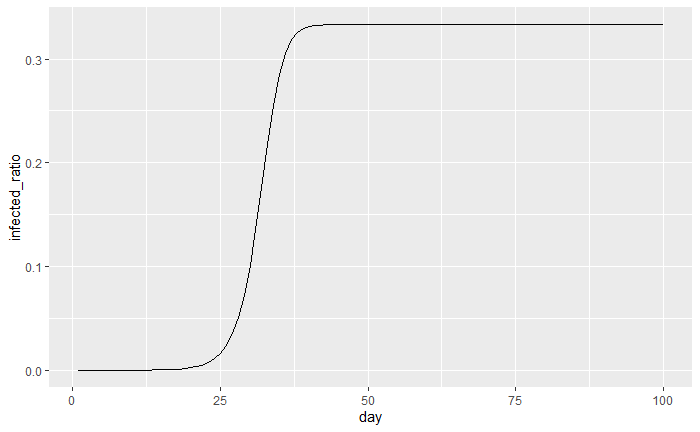
In this example the infected ratio is changing over time and it changes by the formula, . A critical assumption we made is that new infections only happen once per day. However, does that really make sense? In the real world, new infections don’t just happen once a day, but potentially at every microsecond, or even smaller! These types of dynamical systems are called continuous-time dynamical systems because new people can get infected at any point in the day, not just at the end. In figure 2 we can see the previous example, where infections are now being counted continuously instead of at the end of the day.
 |
|---|
| Figure 2 |
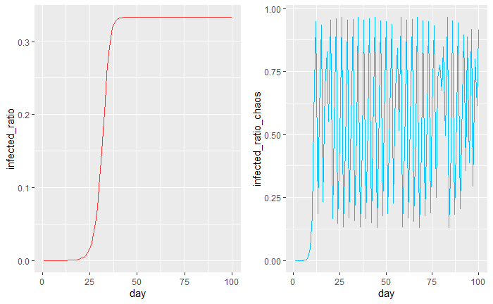
We can see that initially the growth is slow and then it grows “exponentially” and then tapers off at around 1/3 of the population being infected after 40 days. In fact, this trend of exponential growth and then slowing is what many experts believe will happen with COVID-19. What’s interesting about the logistic map is that it takes into account herd immunity. Which is when enough people in the population develop immunity and so once enough people are infected overall infections start to stay stagnant.
What are chaotic systems?
When you hear the word chaos what comes to your mind? Costco on a Sunday, a prison riot, or maybe even a global pandemic. In mathematics, chaos has a special meaning and can be summarized by one simple idea. That dynamical systems may look random, but really are just deterministic with different starting points. Edward Norton Lorenz, an American mathematician & meteorologist summed it up nicely: “Chaos is when the present determines the future, but the approximate present does not approximately determine the future.” Don’t worry if this is making your head spin a little bit, we will unpack these ideas by looking at our favorite example, the logistic map!
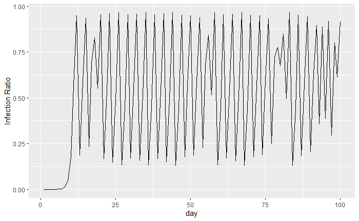
Now, imagine that instead of each infected person giving COVID-19 to 2.5 new people on average, they give it to 4.86 people on average. This would mean that the logistic map would have an value of 3.86. We might expect that more people would get infected sooner and then it would taper off to some percentage of the population higher than 1/3.
 |
|---|
| Figure 3 |
As we can see, now almost 95% of the population is infected on the hundredth day. Incredibly, it seems as though our deterministic equation is producing something that to the naked eye is random.
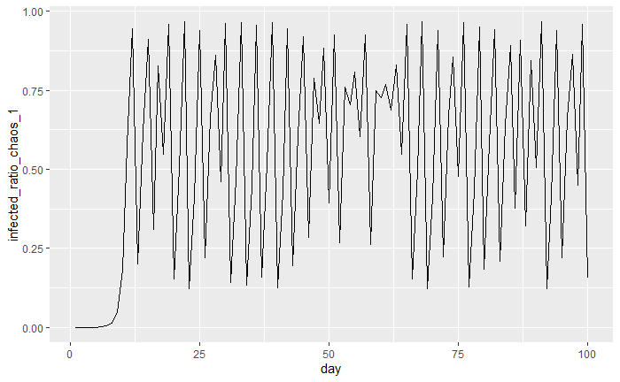
Now let’s investigate what happens if each infected person gives the infection to 4.87 people on average instead of 4.86. What percentage of the population is infected on the 100th day? Stop and think before reading on, will it be higher, lower, or about the same? Instinctively, it would make sense that only a slight change in our value would lead to only a small change in our end result. Let’s see what happens in the plot below:
 |
|---|
| Figure 4 |
We can see that if the value is 3.87, then on the hundredth day only 15.5% of people are infected. What’s going on here? We changed the value by a tiny amount and then suddenly a hundred days later 15% of the population is infected vs 90%. What we are witnessing is a perfect example of Edward Norton Lorenz’s quote, where small changes in initial conditions can lead to large changes down the line.
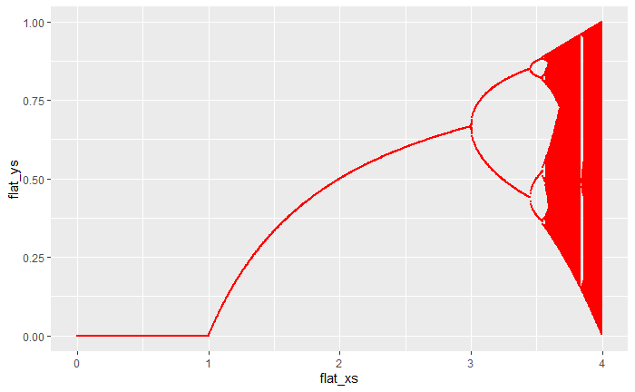
It turns out that if we have an value above 3.5 then the logistic map will exhibit a chaotic nature. In our first example, the $r$ value was 1.5 so the system wasn’t chaotic. However, in the previous two examples, the value was 3.86 and 3.87 respectively which turned out to be chaotic systems. It’s important to remember that the contagiousness level, , is one less than how many people each person infects.
We can visualize this chaotic nature in what we call a bifurcation diagram down below:
 |
|---|
| Figure 5 |
On the x-axis of the plot we have the value, and on the y-axis, we see what infection ratios the system will tend to. For example, when is 1.5 we can see that the system will tend to 0.3333, which is what figure 1 suggested. Now what’s interesting is that as gets above 3.5 it turns out that the system starts to tend towards multiple values. This is a visual representation of the chaotic nature of the system. When was above 3.8 as we saw in figures 3 and 4, the logistic map doesn’t tend toward one value.
The apparent “randomness” that we saw in figures 3 and 4 is a result of this phenomenon. The percentage of the population that is infected will not be stagnant and will keep bouncing around with high values. This turns out to be a consequence of the herd-immunity aspect of the logistic map. Now that we have seen how the logistic map can be chaotic with high values, let’s take a look at a tool we can use to analyze these dynamical systems.
How can we determine which dynamical system is rougher?
Let’s take a look back at figures two and three, and let’s try to see which version of the logistic map seems rougher.
 |
|---|
| Figure 6 |
Instinctively we can see that the red line seems to be smoother than the blue line, just by our naked eye. What if we wanted to quantify how much rougher the blue system is than the red system? It would be almost impossible by our naked eye to determine that difference.
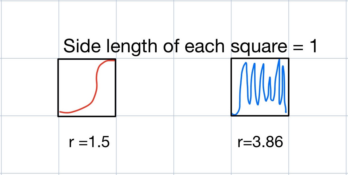
So how can we quantify roughness? Let’s look at some hand-drawn rough sketches of these two examples to build intuition. From first glance, we can see that in figure 7, the logistic map with an value of 1.5 seems to be smoother than the logistic map with an value of 3.86.
 |
|---|
| Figure 7 |
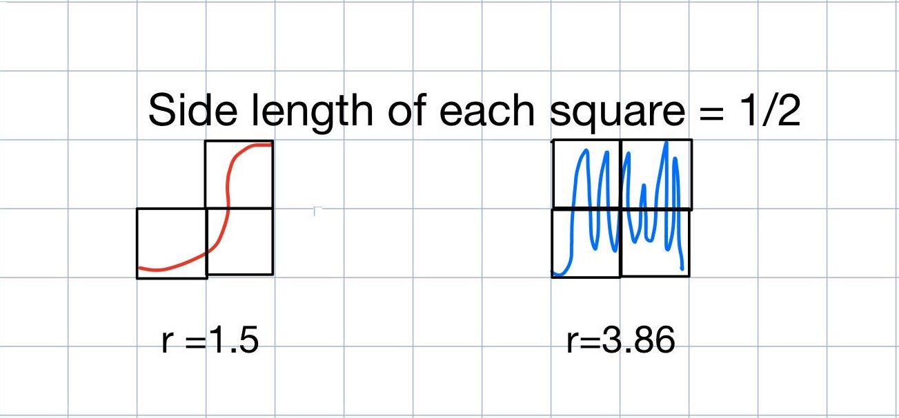
We can see that only one box on the grid has any part of the logistic map with $r$ value of 1.5 in it. Similarly, there is only one box on the grid that has any part of the logistic map with = 3.86. Now, we are going to keep everything the same except for making the boxes smaller. In fact, we are going to make each box have a side length of 1/2 and see how many boxes have parts of each system in it.
 |
|---|
| Figure 8 |
Now that we have decreased the side length of each square to 1/2, let’s count how many boxes have each of the systems are in. We can see that there are only 3 boxes that have the red system in it. On the other hand, there are 4 boxes that have the blue system in it.
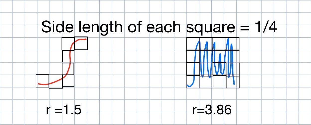
Interestingly, as we decreased the size of the boxes, the time series we thought was rougher covered more boxes than the smoother one. Let’s see what happens when we decrease the size of the boxes even further to having a side length of 1/4.
 |
|---|
| Figure 9 |
With each box now having a side length of ¼, we can see that there are only 7 boxes that have any part of the red system in it. While there are now 15 boxes that have some part of the blue system in it.
Let’s remember our original goal, we wanted a way to quantify how rough a dynamical system was. We can summarize the results from the three images above in a table:
| Side Length of Each Box | # Boxes with system with $r$ = 1.5 | # Boxes with system with $r$ = 3.86 |
|---|---|---|
| 1 | 1 | 1 |
| 1/2 | 3 | 4 |
| 1/4 | 7 | 15 |
As the boxes get smaller the number of boxes with time series B in it is increasing at a faster rate than the number of boxes with time series A in it. By looking at how the number of boxes changes as the size changes we can produce a number called the box-counting dimension of the system. The higher the box-counting dimension, the rougher the system because they “fill-up” more space.
Congratulations, you know understand the idea of the box-counting dimension, which is a way to measure the roughness of not only a dynamical system but also any shape. In our example, since we are working in two dimensions, the box-counting dimension can’t be smaller than 1 and can’t be larger than 2.
You could verify this for yourself by looking at two extremes; a line which has a box-counting dimension of 1, and a ,square, that has a box-counting dimension of 2. It is also important to note that this procedure of making really small boxes is one way to calculate roughness and there are many other ways to do so.
It turns out that faster the rate at which boxes are covered when we make the boxes really really small, the higher the dimension will be and in turn the roughness of the system. For the more mathematically inclined the formal definition of the box-counting dimension is the following:
Let and let and let B be a minimal-dimensional, minimally-sized box such that . The box-counting dimension of is
Where is B cut along each axis into equally-spaced slices[1].
Instead of counting boxes ourselves, we can enlist a computer to calculate it for us. We can see the results in the table below:
| value of logistic map | Estimated Box Counting Dimension | |
|---|---|---|
| 1.5 | 1.02 | |
| 3.86 | 1.672425 |
This confirms our intuition from the start; that the rougher the system looks, the higher the box-counting dimension is.
By understanding how much rougher these different systems have, we can get a better idea of how variable the infection ratio is. With a logistic map with an value of 1.5, we can see by its low box-counting dimension that the infection rate stabilizes. On the other hand, when the logistic map had an $r$ value of 3.86 we saw that the infection ratio kept bouncing all over the place. Even though we used the box-counting dimension to look at the roughness of the logistic map, it can be used to look at other systems such as rainfall data or the stock market.
As it turns out, mathematics can be an important tool to analyze pressing problems such as COVID-19. Without understanding the mathematics deep below the surface, then its incredibly difficult to understand what’s happening above the surface. So can shapes, systems and chaos help us understand pandemics? Yes, but more importantly they may be able to help us understand humanities next crisis.
Special Thanks
Special thanks to Professor Jason Siefken who taught me linear algebra and chaos, dynamical systems, and fractals. I would not be the amateur mathematician that I am today without his exceptional teaching.
Bibliography
[1] - Siefken, Jason. MAT 335 Notes, 2020, github.com/siefkenj/2020-MAT-335-webpage/blob/master/notes/dynamics.pdf.
